Projects
Filter ProjectsWillow Creek Elementary
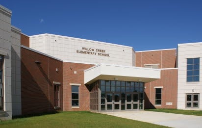
The two-story, 108,000 ft2 Willow Creek Elementary School was built in response to increased enrollments at the elementary school level. The school opened for the 2009-2010 academic year and features 44 classrooms, a cafeteria, gymnasium, library, computer labs, art, and music classrooms for an estimated 700 students.
The $22.1 million school was designed by AEM Architects, Inc., which also designed the nearby Tilden Elementary Center in Hamburg, PA with CarbonCast High-Performance Insulated Wall Panels. The Tilden school was completed in 2007.
Willow Creek was built in proximity to other Fleetwood facilities and takes the place of an older block and brick structure. According to AEM project architect Justin H. Istenes, the insulated wall panels were chosen for the school because “precast is built to last. The owners toured High’s Denver plant and the Tilden school while it was under construction, and were satisfied they were getting better value with precast insulated wall panels.”
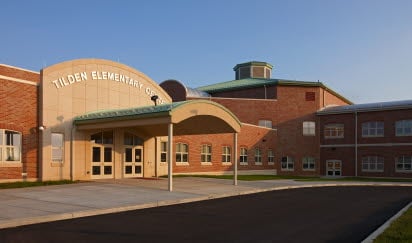
Hamburg Elementary School (Tilden)
An outstanding thermal performance was achieved at Hamburg Elementary school (Tilden) with CarbonCast walls. Amid skyrocketing energy costs and heightened public awareness of green construction practices, more building owners are seeking environmentally friendly solutions without incurring higher costs.
Tilden Elementary Center in Hamburg, PA, is no exception. The school for kindergarten through fifth-grade students will save on heating and cooling costs with innovative precast high performance insulated wall panels engineered, manufactured, and erected by High Concrete Group.
High Concrete’s 10”-thick precast exterior walls on the 110,000-square foot project delivers R-15 performance. They use three inches of continuous XPS insulation (“ci” as defined in ASHRAE Building Energy Code 90.1-2007) sandwiched between a 4” interior wythe and a 3” exterior wythe. C-GRID carbon fiber shear grid connects the two wythes. With relatively low thermal conductivity, the carbon fiber prevents thermal transfer, virtually eliminating hot and cold spots on the interior wall preserving comfort for students.
High’s precast walls helped keep the project on schedule and under budget, both of which are critical for a public school. The project was completed in June 2008—in plenty of time for teachers to welcome students for the first day of school.
Statue of Liberty Museum and Screening Facility
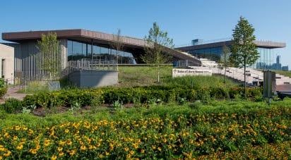
At this iconic location, now stands resilient structures that are dynamic in expression and were inspired by the irregularity of the water’s edge, as well as the geometry of the circular Flagpole Plaza. This is a one of a kind museum and screening facility that leads precast structures into a new level of strength and beauty.
Merging building into the landscape, the design eschews formality in favor of an asymmetrical design that embraces its dramatic setting and changes of form as visitors move around it. The vertical patterning of the precast concrete sandwich panels was inspired by the Palisades cliffs along the Hudson River. The project’s materials link the future of the Island with its past. Inspired by the idea that the museum has been “lifted” from the park, all vertical surfaces are rendered in irregular, vertical patterns suggestive of a tectonic shift; they provide a compositional counterpoint to the building’s dominant horizontality. The precast concrete panels have a deeply textured, irregular pattern, which creates dramatic shadows; this texture reflects the Palisades cliffs of New Jersey.
Mercy Health West Hospital
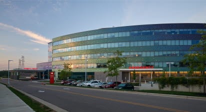
Opened in fall 2013, Mercy Health - West Hospital brings a new level of healthcare to Cincinnati's west side. The 625,000sf project features 250 beds, comprehensive cardiac care, an oncology treatment center, a maternity and birthing center, and Ohio's largest green roof. The medical facility eliminates the need for the local residents to travel outside of the area for full-service medical care.
The medical facility features state-of-the-art care combined with amenities that focus on the patient and their families to create a comfortable and healing atmosphere. This approach to health care architecture, balancing beauty, culture and function set a new standard for hospital design. Connections between architecture, natural light, and landscape promote healing.
Located on a 60-acre wooded site, the hospital's large diagnostic and treatment base is designed to co-locate surgery, imaging, the emergency department, and cardiovascular ICU. Two-bed towers sit on this platform, which features a living roof covered with native plants — providing an ever-changing view from the patient rooms above.
The unique, 107,000sf green roof covers 2.5 acres and has more than 65,000 plants. Patients and visitors can enjoy views of the roof from the patient towers, as well as an observation area. The roof helps maintain cooler building temperatures during summer months, while capturing and holding 75% of rainwater, thus lessening the amount of stormwater run-off.
Lehigh University Alumni Parking Garage
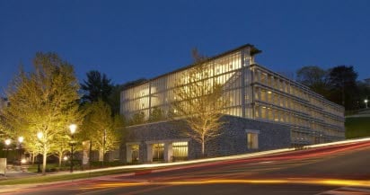
A design-build approach that reused steel forms from an award-winning project resulted in the 315-space Lehigh University Alumni Parking Garage in four to six months less time than typical construction. The form design was recognized with a PCI Design Award in 2002 and again in 2007 when it was repurposed for this project.
The five-level, 104,000 square foot garage for university faculty features 10- by 30-foot precast concrete elements that incorporate slender precast concrete columns and spandrel beams. The structural design eliminated tall, heavy spandrels that are traditionally associated with parking structures, replacing them with an open, lightweight concrete latticework that provides both exciting form and efficient function. The panels' slender columns correspond individually to the 7-foot 6-inch span of the 15-foot-wide structural double tee stems. In addition to bringing in light and providing an open, airy feel, the exterior lattice system blocks headlight beams from reaching into the neighborhood.
Christ Hospital
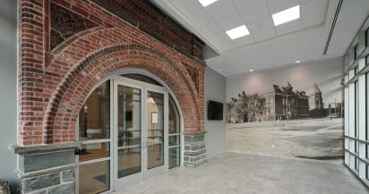
In 2012, the Christ Hospital Network in Cincinnati, Ohio, decided to add an orthopedic center of excellence to its already nationally renowned healthcare facility. The owners worked with an architect to design the seven-story, 381,000 ft2 LEED Silver-certified Joint & Spine Center, which linked it directly to the hospital’s existing surgical and imaging areas.
As part of the broader master plan, the client and architect agreed that the design for the Joint & Spine Center needed to reflect the historical redbrick vernacular of the other campus buildings. It also had to meet strict budget restrictions, deliver a watertight building envelope, and meet the high-performance goals set for the new building. All of these requirements would be met with a precast concrete design.
1200 Intrepid
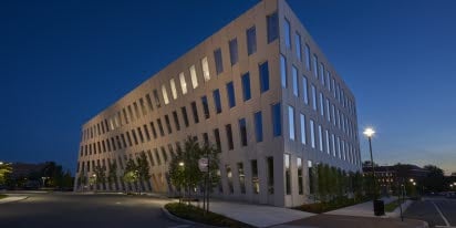
2016's Harry H. Edwards Industry Advancement Award winner proves that precast concrete enables the most innovative architectural designs while providing a highly energy-efficient and durable envelope. One of the most prominent features of the building is the white precast concrete façade, which dips dramatically away from the walkway along the eastern edge, then tips back out again, much like the buildings in a Dr. Seuss story. “One of the key design challenges was to create that curved façade from precast panels,” says David Bosch, engineering team leader for High Concrete Group. The curved load-bearing design was achieved by assembling flat, traditional precast concrete panels to form a complex faceted geometry. An interlocking structural system was embedded within the panels to eliminate the need for traditional precast concrete spandrel panels. “The resulting façade creates an aesthetic versatility that is unique to the project,” Bosch says.
Valvoline Headquarters
Valvoline’s new headquarters was designed to celebrate their heritage as a leader in racing while simultaneously capturing their focus on technology and product innovation. The decision to use precast concrete was made because for a project such as this, it is unparalleled when compared with different frameworks. The double-return panels give this building an alluring quality, highlighted its geometry, and was also financially attainable and able to be produced within an anticipated timeframe.
Reading K-12 School
The Reading Community Schools made the decision to combine its three individual schools into one school that would house 15,000 students. The owners worked with an architect to design the school with a traditional look using brick and limestone trim. The architect, Earl Crossland, was able to achieve that look using precast concrete.
Rosenthal Center for Contemporary Art
The new home of Cincinnati's Contemporary Arts Center embodies the institution's ongoing role as promoter of daring and farsighted artistic strategies. In that creative spirit, the ingenuity of High Concrete Group contributed to the completion of the award-winning building.
Founded in 1939 as the Modern Art Society, the Center was one of the first institutions in the United States dedicated to exhibiting contemporary art, and has always included design and architecture in its mandate. Consistent with its probing of the outer limits of the current art scene, the Center, under the leadership of Director Charles Desmarais, selected Pritzker Prize-winning architect Zaha Hadid to design its new facility: The Lois and Richard Rosenthal Center for Contemporary Art. It is the first major American museum designed by a woman. Hadid remains on the cutting edge of Deconstructivist architecture, both challenging and, in her own way, responding to context.
The unique modern art museum is primarily made of precast concrete wall panels that were fabricated and installed by High Concrete Group’s Springboro, Ohio facility. High was selected for the complex project because of its reputation and experience with high-end architectural concrete. Working closely with the architect, High Concrete designed 140 spandrel panels for the 82,265 square-foot building.
Overall, in a building dedicated to creativity, it is only fitting that High’s functional and aesthetically pleasing panels helped the Rosenthal Center truly become a work of art.
New Brunswick Transit Village
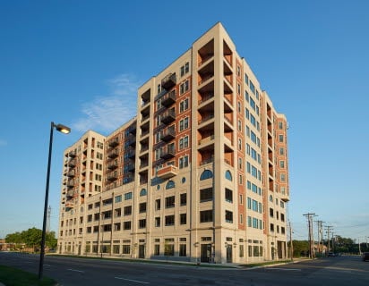
In a recent and unconventional interpretation of this concept, the New Brunswick Development Corporation (Devco) has completed Gateway Transit Village, a mixed-use, transit-oriented design consisting of a 24-story building and a new pedestrian walkway directly adjacent to a NJ Transit/Amtrak station. Located in the heart of downtown New Brunswick across from the Rutgers University campus, the new $150 million, 632,000-square-foot structure is the tallest parking garage and building in the city. A precast parking structure from High Concrete Group LLC forms its core.
Built as part of an ongoing revitalization effort, the new complex is intended to help bring renewed life to a site that is vital to the city, but that has been under-utilized for many years. With views of the Raritan River, the apartments and condos in the tower are targeted to attract people who already live and work in New Brunswick. Twenty percent of the units are set aside for moderate- and low-income owners.
The project is unconventional in several ways. "Gateway is the most urbanly dense transit village in New Jersey," notes David J. Stuart, project manager for New York City-based Meltzer Mandl Architects. "Everything that’s normally incorporated into a transit village has been combined into a single structure."
"Also, precast concrete parking garages are not typically designed to support taller and more complex structures above them; they are usually stand-alone buildings. To place a 14-story building on top of a garage is daring structural engineering," says Stuart.
Gateway Transit Village consists of a 10-story precast parking garage with 697 parking spaces, topped by a 14-story steel-frame and hollowcore residential tower containing 150 apartments and 42 condos. The structure is wrapped by 120,000 square feet of offices and a series of street-level commercial spaces for tenants, including the Barnes & Noble College Bookstore for Rutgers and offices for the New Brunswick Parking Authority and the Rutgers University Press.
Stuart notes that Gateway Transit Village doesn’t relate to its context as much as redefine it. "A typical approach would be to hide the parking garage, and disguise the precast," says Stuart. "At first we considered thin brick, to match other parts of the structure. But we decided that we wanted an exposed concrete aesthetic for the podium, to let concrete be concrete, and to show its inherent nature. Precast concrete can be quite elegant, minimalist. It was economical, fast, and gave us pleasing aesthetics."
The majority of the garage was cast in a standard High Concrete Group buff architectural mix and finished with a light sandblast. Simple reveals set up a rectangular pattern that brings scale to the horizontal spandrels and complements the openings between them on the way up. Spandrels at the top are finished with a small cornice.
The parking garage required 24-foot and 36-foot spacing between the support walls to optimize the parking spaces and 12’-wide precast double tees. The residential tower called for a different supporting grid, which had to have its column lines aligned with the garage support walls via 10-inch-thick hollowcore plank spanning up to 36 feet.
"This is a good use of precast," says J. Benji Alper, PE of engineering firm Severud Associates’ New York office. "While the precast garage is only 10 stories, the overall structure still stands at 24 stories tall, requiring the precast walls to resist the forces for the full lateral and gravity loads of the 24-story building." He discusses the approach in the Structure Magazine article,"Integration of Diverse Structural Systems and Design Delegation in a Mixed Use Space."
Alper notes that communication was critical in the project. "Immediately after the contract award, weekly meetings were conducted with the entire design team which included members from the precast manufacturer’s engineers, the structural engineer, the architect, the parking consultant, the owner, and the general contractor. Other trades, including the steel fabricator, the steel detailer, and the erector, also would often attend. The meetings were a key part of an iterative design process between Severud and High Concrete Group."
Academy of World Languages
The strikingly attractive building features several complementary finishes within each panel. Exposed aggregate provides bold texture and an earthiness that befits the school’s wooded surroundings. A subtle, uniform sandblast finish appears alongside an acid etched treatment that deepens colors for contrast and imparts a stone-like appearance. Horizontal lines of vibrant ruby red tiles below crimson-framed windows add contrast across the façade, while vertical lines of blue tiles almost make the seam between panels an aesthetic feature. Finally, insets of alternating yellow and blue tile provide a visual counterpoint to the exterior light fixtures directly above them. Overall, it’s a colorful, vibrant exterior that reflects the energy and discovery of learning.
Merrill praised the aesthetic versatility of precast. “It allowed us to play with colors and textures, maintaining a simple yet still attractive building,” he said. “We were able to gain economies through repetitive patterning and use scale and massing to keep the building interesting and not overwhelming to the kids.”
The benefits extended to the interior walls as well. The precast sandwich wall panels were prefinished on the inside with paint filler and institutional grade paint. Durable concrete will withstand decades of heavy use and abuse from energetic children. Furthermore, the prefinished interior eliminated the expense and time that a field-constructed interior would have entailed.
Public School 667
As demand for updated schools continues to grow in a major metropolitan area, city construction administrators are seeking new solutions to modern issues that existing structures simply can’t address. In a dense urban location, speed and efficiency of construction is a necessity, but a school must also be safe and strong to act as a safe haven for the community, with the ability to last for years to come. Through a collaborative design-build process, our company was tasked with constructing a new K-12 public school in this urban area. This project was one of the first large-scale precast concrete projects taken on by the school’s authority, with precast selected in lieu of typical block, brick, and mortar due to a tight construction site with the surrounding urban environment and limited timing due to the school year's schedule. The new school’s construction included a combination of insulated, spanning, and brick-clad precast panels intended to both blend into the historic neighborhood and act as a modern representation of the surrounding community.
CCHS Wilmington Visitors Parking Garage
As the use of a structure changes over time, the facilities themselves must adapt. Sometimes, this means fully demolishing an existing structure to accommodate the evolving needs of its tenants. This was the case at a regional medical center, where plans were made to replace a parking garage to increase capacity and functionality. The project would feature six levels and a total of 851 parking spaces along with the construction of medical offices within the new structure. The medical center also wanted to design their new garage with flat levels so patients with mobility issues could easily access the main buildings without having to navigate ramps or stairs. It was crucial to avoid disruption of hospital access for employees and patients during construction. The bulk of this project also happened to take place during the peak of a pandemic, meaning that the hospital had higher traffic and that it was even more important to minimize disruption of the medical center’s activity.
University of Pennsylvania Health Sciences Tower
Pulling in the beauty of what the sun can do to a building, the designers captured the memorizing angles consistently throughout the self-cleaning, TX Active white cement mix. The primary design objective was to create a signature architectural building using precast while maintaining a strickt budget. This 10-story 36,735 square foot precast facade was designed with folded triangle faceted insulated wall panels, angled decorative fins, and a deceptive fold from top to bottom of this building. Two of the full precast sides of the building assimilate two large triangles meeting together on one of the three sides. At the seam where those sides meet, the panels either cascade in or out depending on the side you are viewing. The angled decorative fins sit vertically along the outside of windows. These three-dimensional fins rotate the angular peeks from one vertical row to the next. Building the illusion of depth and complexity on the building, this eye-catching feature cannot go unnoticed. Energy efficient faceted wall panels might seem to take a back seat in this beautiful design. With the details in depth created with the folded triangular pattern along these narrow wall panels your eye goes directly to them. This building, built with LEED silver certification contingency, was designed to withstand the future 10 floor addition. A mirrored image of the building standing now will be placed above the existing structure.
NJIT Student Housing
When new student housing was required at an urban New Jersey college, precast concrete was the first and only choice. As a new cornerstone landmark for the campus, the design needed to be one that would both accommodate and represent the tech forward, innovative student body. With the next generation beginning their college selection process, students want single occupancy rooms and amenities that make student housing feel more like a home. This student housing offers bicycle storage, underground parking, a game room, creative space, lounge space, a grass courtyard, and indoor and outdoor cafes.
Commerce Center
As part of their large, strategic plan to attract new business activity and increase the local community’s population by 11%, a mid-sized Mid-West city planned to redevelop an underutilized downtown parking lot into a mixed-use structure. Located within an up-and-coming community along the river, the proposed live-work-play structure was intended to complement the vibrant art scene, great local dining options, and abundant surrounding recreation and athletic activities. Excited by the potential of this project, the regional development authority secured funding for the project, motivating local officials to get permits and begin work as soon as possible. The mixed-use building included ground floor retail space, attached three levels of parking, and six floors of residential apartments. Intended to become the heart of the new community, the structure was designed with longevity and a classic design aesthetic in mind. This project was originally designed as hand-laid brick and block construction around a cast-in-place concrete frame. As construction began, this design proved to be challenging, costly, and time-consuming. An extremely tight construction site and the state of community relations made setting up appropriate scaffolding for the masonry work nearly impossible. Seeing these complications, the plan was modified to use insulated precast concrete panels with thin brick. The conversion to precast concrete resulted in both time and money savings, but it also helped to maintain strong community relations by causing limited construction disruption.
Indianapolis Zoo Chimpanzee Exhibit
When the Indianapolis Zoo planned a new chimpanzee exhibit, they needed a building material that could withstand the chimpanzees’ curious nature and tendency to dig at weak points. Precast concrete was selected for its ability to meet both structural and aesthetic requirements.
The exhibit features three distinct areas for zoo guests to interact with the chimpanzees: the arena, the cognition building, and the main entrance. Designed to house up to 30 chimpanzees, the exhibit replicates key aspects of their natural habitat. Precast concrete was chosen for its cost-effectiveness and visual appeal. Chimpanzees are naturally inquisitive and prone to digging when they find openings. The smooth back finish of the precast panels prevents the chimpanzees from causing damage.
Drisdick Hall Villanova Univeristy
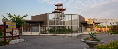
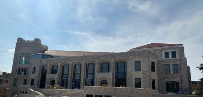
The expansion of Villanova University’s College of Engineering, now housed in Drosdick Hall, prominently features the use of precast concrete. This material was chosen for its durability and efficiency, allowing for the quick erection of the building envelope, which minimized disruption to campus activities. The project utilized 488 pieces of precast concrete with a stone veneer, contributing to the building’s aesthetic appeal and structural integrity. The use of precast concrete also facilitated the creation of a seamless and cohesive design, integrating the new expansion with the existing campus architecture. This innovative approach underscores Villanova’s commitment to sustainable and efficient construction practices.
Villanova University Pedestrian Bridge
This collegiate pedestrian bridge harmonizes with a collegiate campus that has been around for years. The environment of a college tends to develop around them, causing a need to adapt. Taking something that was, “a necessity and turning it into an asset” was an added benefit to the Architect. Ultimately plastic and versatile, precast concrete helps designers realize their vision even when it’s not the hero in the visual. In this project, harmony, and consistency with the campus aesthetic was a high priority to both the University and the designers. To achieve this goal, the design included a fieldstone veneer to the exterior of the precast bridge following erection except for the architectural panels over the road. The panels over the existing road had the fieldstone applied by the precast manufacturer to the panel prior to being transported to the location. This helps cut down road closure time and boost efficiency.
Riverside Hospital Neuroscience Tower
The Riverside Hospital Neuroscience Tower project is a 10-story, 437,000-square-foot addition to an Ohio Health campus. The project is the only one of its kind and is a state-of-the-art, world-class brain and spine care destination. The project includes 224 private rooms and a large interior atrium the size of two full-size basketball courts.
The exterior features 72,390 ft2 white, precast concrete panels as well as a series of blue-tinted, vertical windows. This was done to resemble the other buildings on the campus. These buildings were built at different times, with different materials, but many feature white brick walls surrounding vertical rhythms of windows. “We wanted to stay away from bricks,” said the architect. “They have an institutional connotation and can make a building appear bigger.”
Precast panels were utilized on the exterior of the building to cover a substantial portion of the facade. Precast was also used to clad a large portion of an interior courtyard that began at the third level of the structure with a rooftop green space/garden area and concluded seven stories higher at the penthouse level.
Penn State Hershey Campus Parking Garage
Inspired by the rolling hills in Pennsylvania, the eye-catching waving spandrels are the first element to greet you as you drive onto the health campus and the last you pass as you leave. Being in such prime real estate, the owners did not want this to be an ordinary parking garage. The Architects took on the challenge with inspiration from the land around them and created a total precast concrete marvel with 1,235 parking spaces with room to expand as needed.
Red Rose Parking Garage
Once bustling with retail business and pedestrian traffic, the City of Lancaster, PA is working toward rebuilding a vital and vibrant downtown. Designed with an intention to stimulate the Lancaster economy with much-needed commuter and transient parking and 15,000 square feet of retail space on two floors, the 185,000-square-foot Queen Street Station Parking Garage complements the city’s historic streetscapes and creates a pedestrian-friendly aesthetic.
Nassau 8th Precinct
Following Hurricane Sandy in 2012, many structures owned by Nassau County in New York state were evaluated for structural damage, including the police precincts. Prior to the storm, several of these buildings had already been in need of renovations to accommodate a growing police force and resolve problems of aging infrastructure, and the storm accelerated this need, says Gilbert Balog of LiRo Architects + Planners.
In the 8th District, Nassau County wanted to replace the 1950s-era frame and brick precinct buildings with structures that communicated civic pride and could withstand the onslaughts of future major events. “Resiliency was a major factor in the selection of precast concrete construction,” says Dianne Pohlsander, design architect for LiRo. “In fact, everything came together with precast concrete: resiliency, fabrication that wasn't weather dependent, constructability, and the desired aesthetics.”
Precast concrete also helped address unique logistical challenges on this project. Construction was constrained by long and narrow site, and, because the new precinct house was constructed at one end while the old building stayed open for operations at the other, the team was under pressure to complete the project quickly with minimal site disruption. “Precast concrete gave us that quick erection time that we needed,” Pohlsander says.

